Web Design & Digital Resonance
- So Restaurant
Contemporary Japanese restaurant
So Restaurant is a Japanese restaurant with a unique and contemporary atmosphere within walking distance of the center of padua.
An ideal destination for an unforgettable dining experience where you can savor exclusive sushi dishes, with an all-you-can-eat menu that features refined flavors and quality ingredients.
Brand Identity
Fusion mix of online and offline
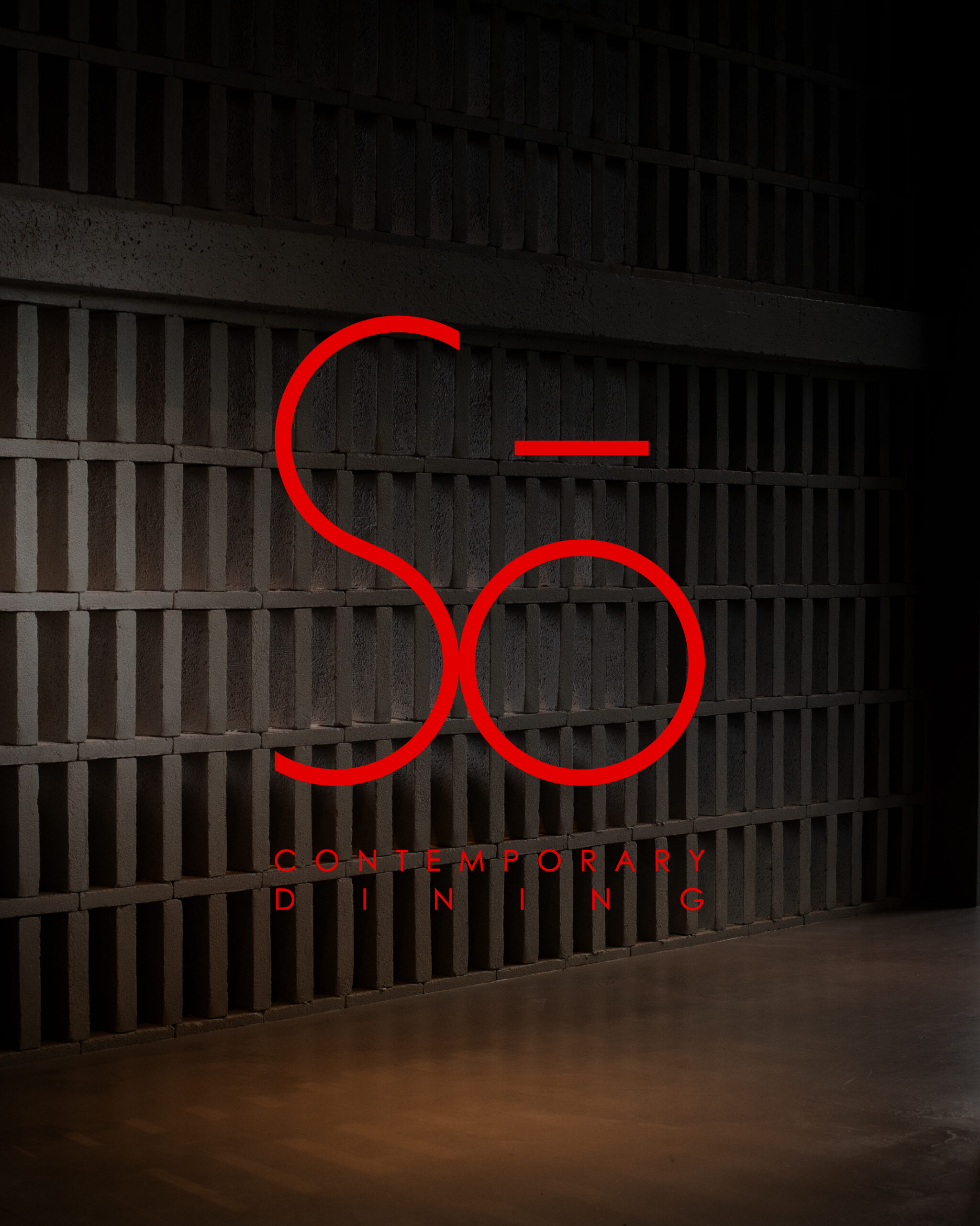
Creation of a unique and recognizable brand identity for the launch and opening of Sō Reastaurant. The mission was to immediately convey the concept and positioning of the restaurant.
Each element was designed to reflect the modernity and elegance of the restaurant, with a color palette and graphic style that recall the harmony typical of Japanese culture. The tone of voice was also studied in detail to ensure consistency in every communication channel, making the restaurant instantly recognizable.
/02
Social strategy
A journey without boundaries
The online communication strategy aims to enhance the restaurant both on social networks and through a tailored website. Social media management included the creation of original content, mainly photography combined with eye-catching and curated graphics designed to enhance the brand and engage the audience. In parallel, the website combines aesthetics and functionality with a modern design that reflects the brand image.
/03
Shooting
A refined synesthesia
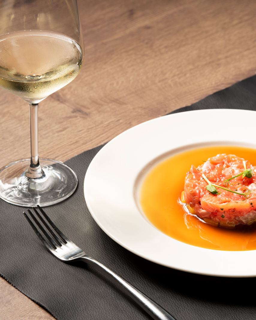
The shots play a key role in the restaurant’s storytelling. Dedicated shoots highlight both the dishes, made with care and attention to detail, and the location, characterized by a refined and welcoming atmosphere.
/04
Offline communication
Beyond the boundaries of digital
Alongside the digital strategy, offline communication is also taken care of, producing a series of promotional materials that complement the project. Event posters, personalized fidelity cards and dedicated pages in local magazines support the launch and consolidate the restaurant’s presence in the area. Each element was designed to be in line with the brand’s visual identity, maintaining consistency and reinforcing the message even outside digital spaces.
– discover more stories –
 Rizzato Calzature – Web graphic design & Digital Resonance
 King's – Brand Identity & Digital Resonance
 Schiopetto – Creative Shooting & Social Media
 Horizon Tennis – Brand Identity & Communication Strategy
 Volpe Pasini – Creative Shooting & Social Media
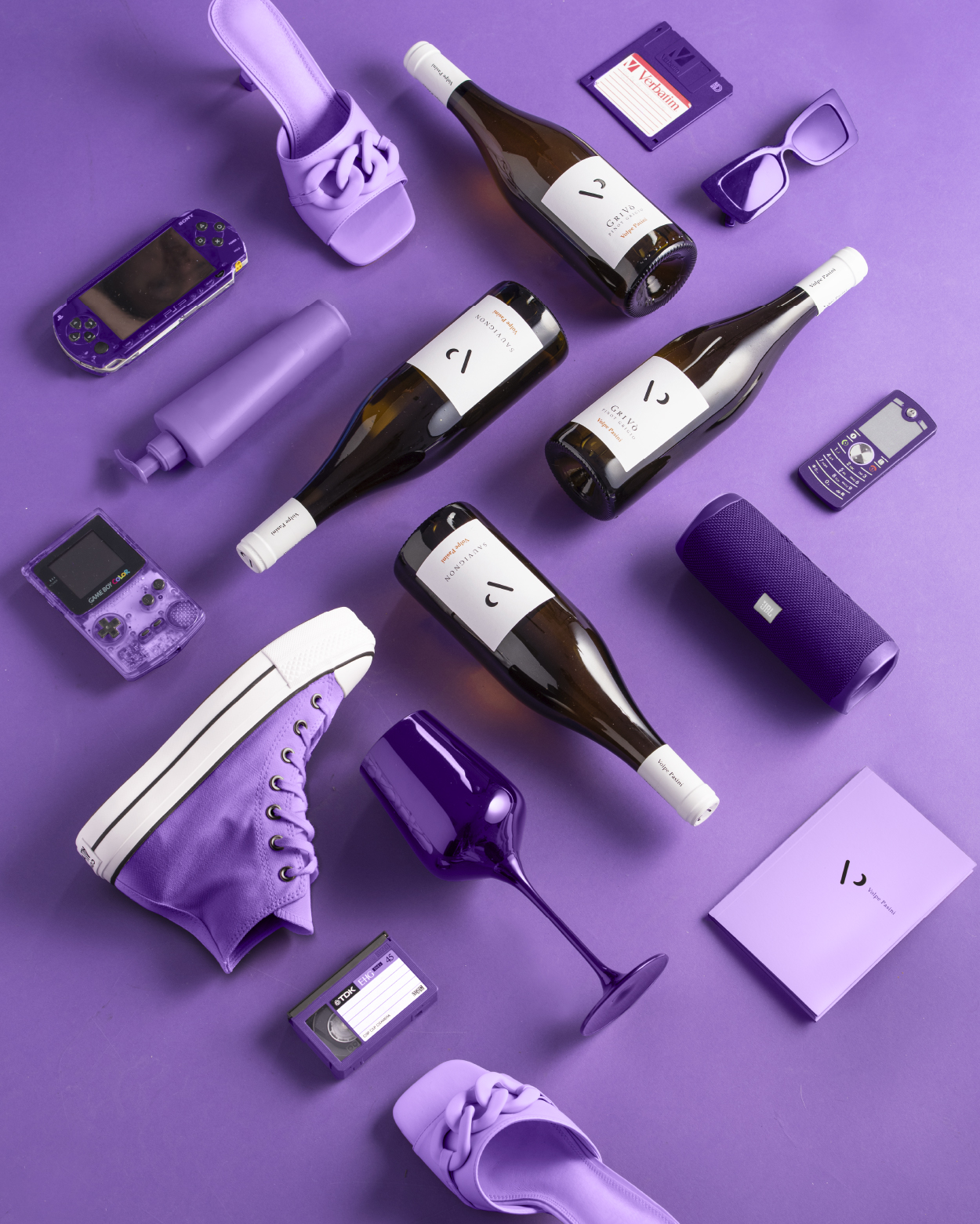 Wine Next – Brand Identity & Communication Strategy
 Black Sheep – Graphic Design & Digital Resonance
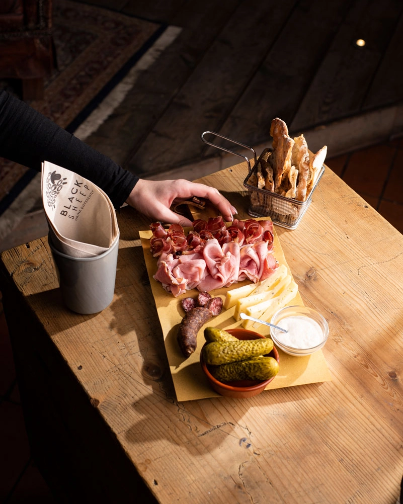 Vecio Piave – Brand Identity & Communication Strategy
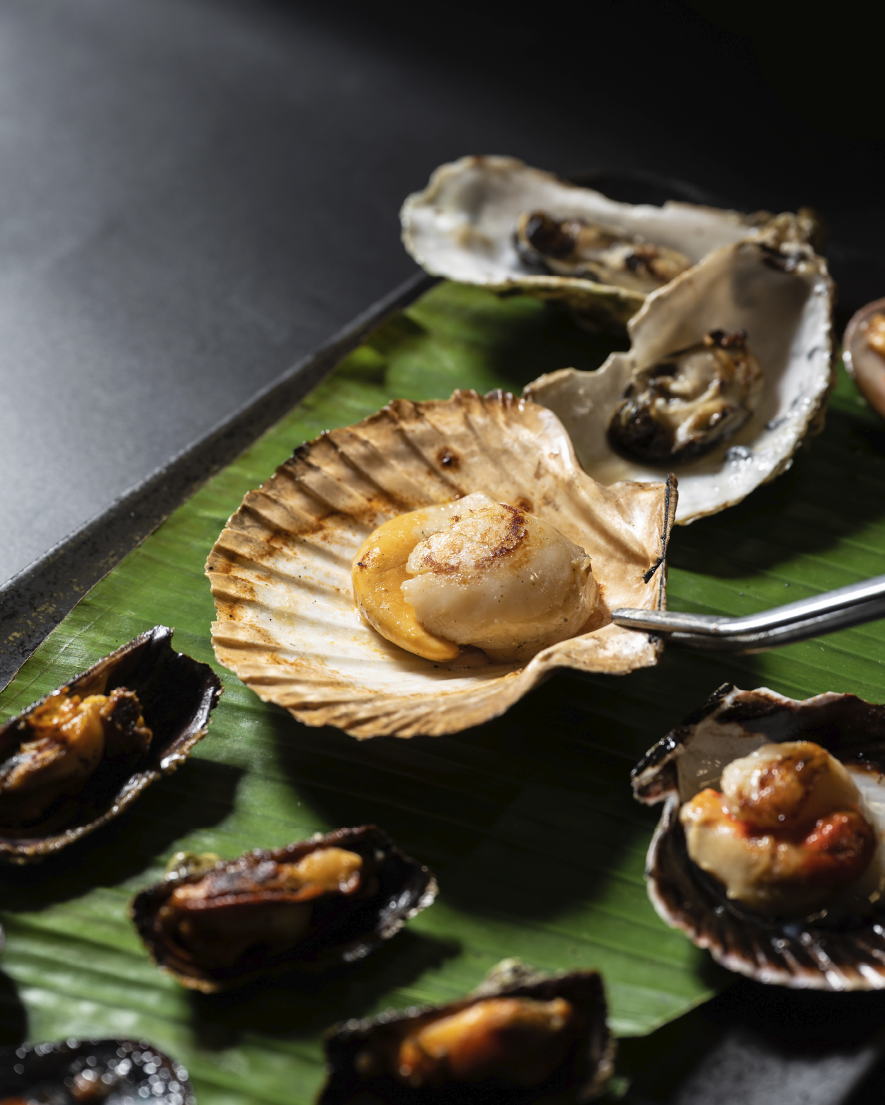 Ovosodo – Brand Identity & Communication Strategy
